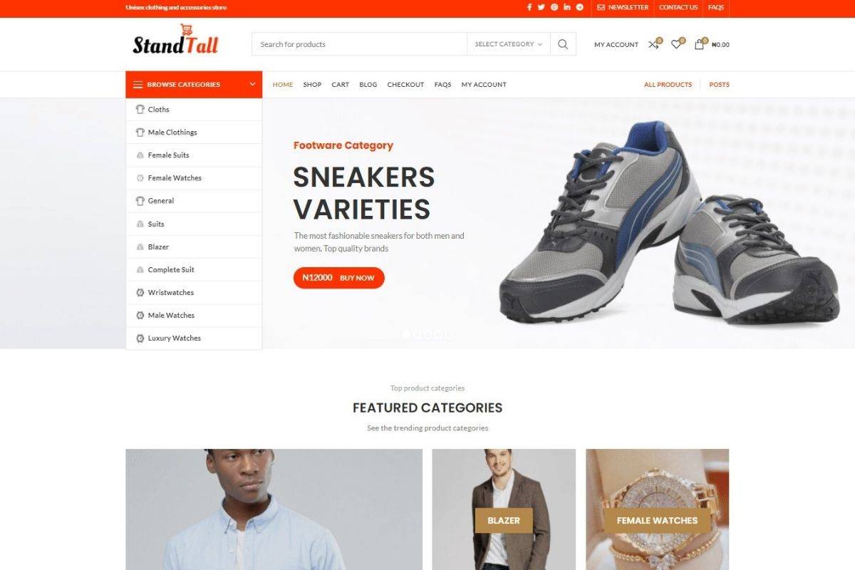
The choice of website fonts might seem purely aesthetic but they play a surprisingly significant role in your website’s speed, user experience, and even search engine visibility.
Unoptimized fonts can lead to sluggish load times, a frustrating experience for visitors, and potentially hurt your search rankings. On the other hand, strategic font choices can transform your website into a high-performance asset that visually engages customers and loads with lightning speed.
This guide will demystify the world of website fonts, empowering you to make informed decisions that benefit both your brand and your bottom line.
Why Website Font Optimization Matters

1. First Impressions Count (and They Need to Be Fast!)
Slow-loading website fonts can lead to a jarring user experience called FOUT (Flash of Unstyled Text) or FOIT (Flash of Invisible Text). This means visitors briefly see unstyled text or no text at all before your chosen fonts render, creating a disjointed and unprofessional first impression. Studies show that even minor delays can increase bounce rates, meaning lost potential customers.
2. SEO Impact
Google and other search engines factor page load speed into their ranking algorithms. Unoptimized fonts directly contribute to slow load times. This means a poorly optimized website could struggle to gain visibility in search results, making it harder for customers to find you organically.
3. User Experience
Font choices impact readability, accessibility, and the overall feel of your website. Difficult-to-read fonts or excessive font loading can frustrate visitors, leading them to abandon your site prematurely. On the other hand, well-chosen and optimized fonts enhance the user experience and contribute to higher engagement.
4. Brand Perception
Your website’s typography is an extension of your brand identity. Inconsistent or slow-loading website fonts can detract from the professionalism and polish you want to convey. Strategic font choices, on the other hand, reinforce your brand messaging and create a cohesive experience for customers.
Best Practices for Website Fonts Selection

Let’s dive into the best practices for selecting website fonts that strike the perfect balance between design impact and performance!
1. Prioritize Web-Safe Fonts
Web-safe fonts are a set of fonts pre-installed on most devices. Using them ensures a consistent and immediate rendering experience across all browsers and operating systems. Popular web-safe font choices include:
- Serif: Times New Roman, Georgia
- Sans-serif: Arial, Helvetica, Verdana
- Monospace: Courier New
2. Web Font Loading Strategies
If your design vision calls for custom web fonts, consider these techniques to minimize their loading impact:
- Preloading: Instructs the browser to prioritize loading key font files for a faster initial render.
- Font-display: Controls how the browser handles fonts while they load (e.g., swapping fallback fonts temporarily, hiding text until fully loaded).
3. Limit the Number of Font Families
Each additional font family and font-weight you add requires loading more files. Be selective! Stick to 2-3 font families that align with your brand aesthetic.
4. Font Subsetting
Font subsetting involves creating a custom font file containing only the characters you use on your website. This significantly reduces file sizes. Several online tools offer font subsetting services.
Designer Insight: Effective Use of Font Weights
Leverage the different weights within a font family to achieve visual variety without sacrificing performance.
Specific Font Pairing Recommendations
While website font choices should align with brand personality, here are some classic pairings that balance readability with visual interest:
- Classic Business Combo: A clean sans-serif like Open Sans or Roboto for headlines paired with a traditional serif like Georgia or Lora for body text. Conveys both professionalism and approachability.
- Modern and Elegant: Pair a bolder sans-serif like Montserrat or Poppins for headings with a lighter sans-serif like Lato or Raleway for the main content. Creates a contemporary feel.
- Expressive and Impactful: Combine a display font (often more decorative) like Playfair Display or Oswald for limited use in titles with a simple sans-serif for the bulk of your text.
Designer Tip: When using custom web fonts, always have a web-safe fallback option to ensure your content remains readable while the custom font loads. Also, start with a strong primary font, then choose a complementary font with a contrasting style or weight. Consider the tone you want your website to convey when making selections.
Resources for Finding Font Inspiration and Tools
- Google Fonts: (https://fonts.google.com/)
- Font Pair: (https://fontpair.co/)
- Adobe Fonts: (https://fonts.adobe.com/): Requires a Creative cloud subscription.
- Font Squirrel: (https://www.fontsquirrel.com/).
Conclusion
Strategic font choices are essential for a fast, visually appealing, and successful business website. Prioritize clarity, limit font families, leverage loading techniques, and always balance aesthetics with performance. Remember, optimized fonts lead to a better user experience, higher search visibility, and a stronger competitive edge.
Ready to transform your website’s typography? Experiment with the resources and implement these optimization best practices for a noticeable boost in performance and style.


