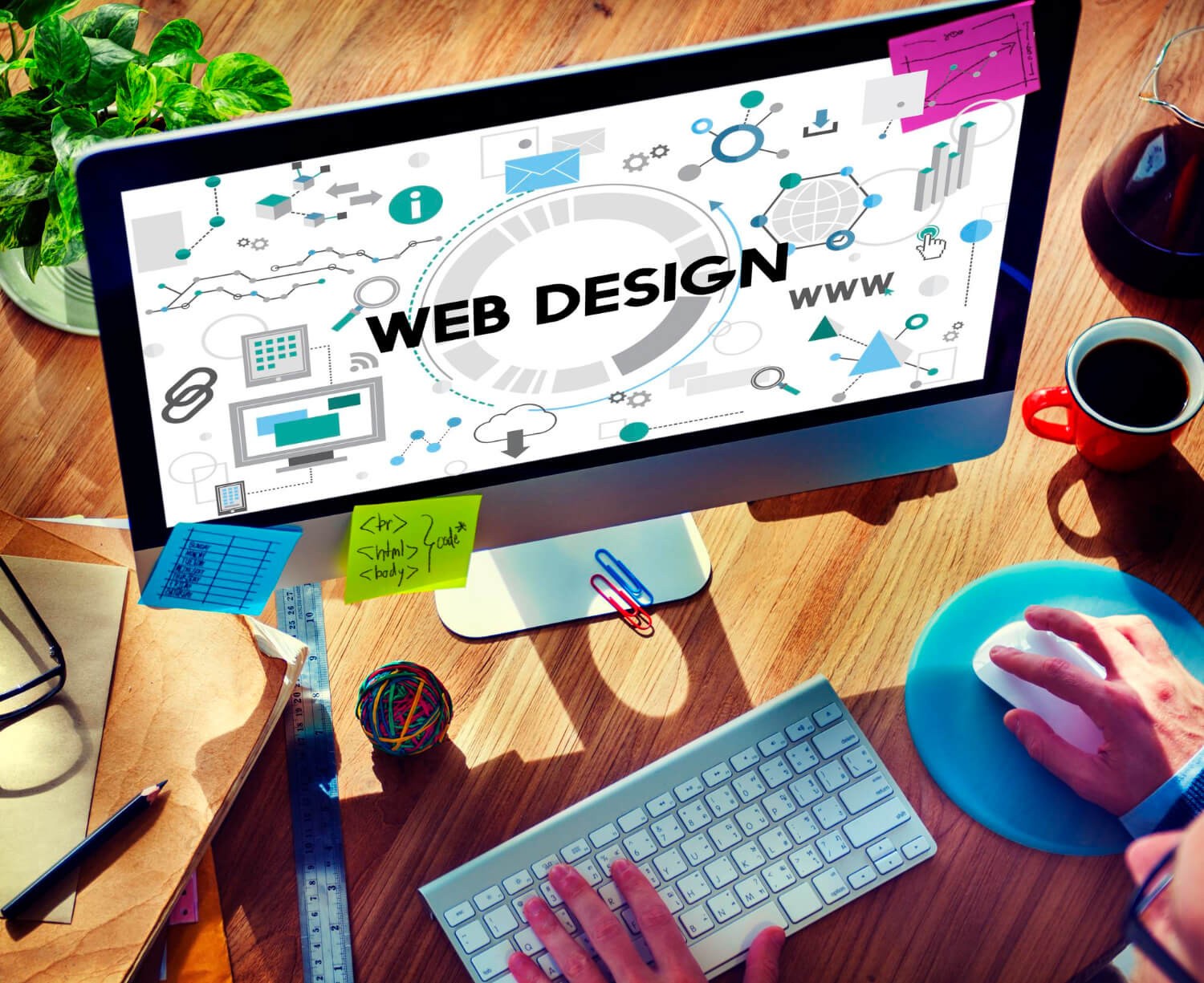
Have you ever wondered why some websites effortlessly guide you toward a purchase, while others leave you lost? Smart web design isn’t just about looking good – it’s about understanding how users think and using that knowledge to create an intuitive experience
By understanding the psychology behind web design, you can influence user behaviour; turning passive visitors into engaged users who take the steps YOU want them to – whether it’s signing up for your newsletter, making a purchase, or contacting you for more information.
7 Ways to Use Web Design Psychology to Influence User Behaviour

Here are 7 surprisingly easy strategies to subtly nudge visitor behaviour and boost engagement on your site.
1. The Power of Defaults
Our brains are wired for efficiency, and that includes taking the path of least resistance. This is where the concept of defaults comes in with web design. Simply put, users are more likely to stick with pre-selected options than go through the trouble of changing them. For example, a newsletter signup box that’s already ticked by default often sees a higher opt-in rate compared to an empty box requiring user action.
Ethical Considerations: While defaults are a powerful tool, it’s crucial to use them ethically. Don’t pre-select options that could negatively impact users, like automatically adding expensive add-ons to a shopping cart. Transparency is key – make it easy for users to opt-out if they don’t want the pre-selected option.
2. Simplify Decisions to Avoid Overwhelm
The paradox of choice is that too many options lead to inaction. This principle, known as Hick’s Law, states that the time it takes someone to make a decision increases with the number of choices available. Instead of overwhelming users with endless options, Hick’s Law teaches us to guide them through streamlining options and information architecture. Here are some ways to do this:
- Product filtering tools: Allow users to narrow down options based on specific criteria.
- Curated starter packs: Offer pre-selected bundles of products or services, eliminating the need for individual selection.
- Tiered pricing structures: Present clear packages (e.g Gold, Silver, Bronze) with distinct features, making it easier for users to choose the one that aligns with their needs or budget.
3. Harness Social Proof
We’re social creatures, and our decisions are often influenced by what others do. Think about it – have you ever downloaded an app because it had a ton of positive reviews? This is the power of social proof in action. To leverage it on your website,
- Showcase positive feedback and reviews from satisfied customers.
- Highlight products that are particularly popular with your audience.
- Build trust by associating your brand with well-known companies.
4. Colour Psychology
Colours have a profound effect on our emotions. This is why savvy marketers carefully choose the colours that resonate with their target audience. You can also consider colour psychology when designing your call-to-action buttons! Here’s how you can use colour to your advantage.
- Warm colours (yellow, orange, red): Evoke feelings of energy, optimism, and urgency. Use strategically for sales and limited-time offers.
- Blue: Inspires trust and security. Makes sense for banks, tech companies, or any brand selling reliability.
- Green: Associated with health, nature, and growth. Perfect for brands in the wellness or sustainability industries.
5. Visual Cues: Guide the Eye Where You Want it to Go
Subtle design elements can significantly influence where users focus their attention on your website. Here’s how to harness the power of visual cues:
- Arrows and directional lines: Lead the user’s eye to important areas of your page.
- Contrasting pops of colour: Strategically highlight key elements like CTAs.
- White space: Creates a sense of “breathing room,” preventing overload and helping guide focus.
- Images of people gazing in a specific direction: Our eyes naturally follow where others are looking. Use this to direct attention toward your CTA or sign-up form.
6. Urgency & Scarcity
Fear of Missing Out (FOMO) is a powerful psychological trigger. When we perceive something as limited – whether in time or quantity – we’re more likely to want it. To use urgency and scarcity principles responsibly,
- Use limited-time offers: Countdown timers or “Sale ends today!” messaging create a sense of immediacy.
- “Only X seats left”: This technique works particularly well for webinars, events, or products with limited inventory.
- Stock scarcity: Displaying “Low Stock” notifications on e-commerce products subtly nudges users to complete their purchases.
7. Make it Fun
Adding elements of playfulness and rewards can transform mundane tasks into an enjoyable experience for users. Here’s how gamification can boost engagement on your website:
- Progress bars: Visualizing progress towards completing a user profile or making a purchase feels satisfying.
- Points systems: Offer points for actions like signing up, leaving reviews, or referring friends. These points could be redeemable for discounts or exclusive perks.
- Badges and playful levels: Reward loyalty and encourage continued engagement with badges for milestones, or lighthearted titles for frequent customers.
Master the Psychology of Conversions
Ready to transform your website into a conversion powerhouse? Check out our other resources on designing landing pages that convert and creating the perfect CTAs. We specialize in applying these psychological principles to our web design to optimize user engagement and boost your bottom line. Contact us today for a free consultation. We’ll do a free homepage audit and identify the changes that will yield the fastest results.